

Quanta English is an online English learning platform that caters to a wide range of ages—from preschoolers to adults. The site emphasizes interactive and modern learning methods, particularly through a digital game-based learning approach and the use of authentic materials from Cambridge University Press.
Your task as a designer/developer is to create a website that is not only visually appealing but also highly conversion-oriented: free trial sign-ups, placement tests, and direct enrollment in online classes.
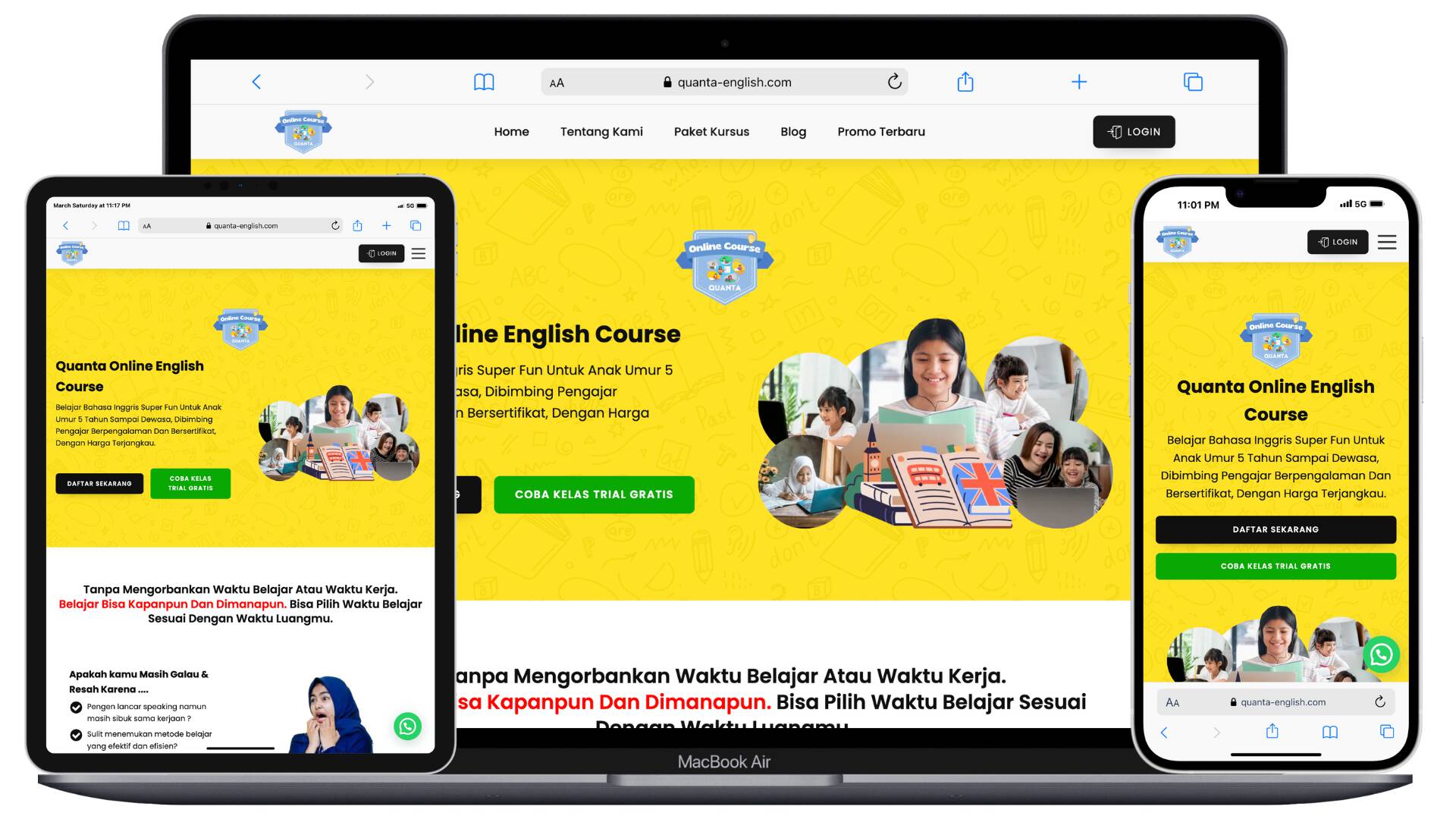
Home Page Analysis
The home page displays a hero section that directly addresses visitors' pain points: "want to speak fluently but busy," "have trouble finding effective methods," "need a competent tutor." Quanta English
Then, three key values are displayed: authentic Cambridge materials, interactive game-based learning methods, and schedule flexibility (study anytime, anywhere).
The page also lists programs: English for Preschool, Kids, Teens, Adults, Pre-TOEFL, and English for Specific Purposes.
In terms of UX, this is a great approach: visitors immediately get a complete overview of the service, unique value proposition, and a call-to-action (CTA) like "Try a Free Trial Class." However, a note: to increase conversions, you could add real-life visual testimonials, student progress reports, or before/after case studies to strengthen trust.
Registration Page Analysis
The registration page provides a fairly comprehensive form: full name, active WhatsApp number, email address, password, choice of learning start period, meeting type (1x/week, 2x/week), and number of participants (private, two, three, up to 6 people).
This form is very user-oriented because it includes flexible options that align with their learning model (small class, private, group). This demonstrates that the website supports a variety of real-world user scenarios.
Recommendation: Keep the form design simple on mobile, add security/privacy indicators, and quick confirmations (e.g., "Thank you, we will contact you via WhatsApp") for a seamless experience.
Blog & Community Page Analysis
The website also features a blog with educational articles related to learning English, such as "6 Tips for Learning English Super Easily."
Community pages like the SheSpeaks English Club (a women-only community) are also available as an added value for user engagement and loyalty.
This demonstrates a strong content strategy: not only selling courses but also creating a community and resources that help potential students. For your portfolio, this demonstrates that the website project is not just a front-page, but also part of a content ecosystem that supports the client's business.
UX/UI & Technical Aspects
Quanta English's website design reflects a modern style, with clean visuals and intuitive navigation. The color selection and layout are professional and appropriate for the target audience (children and adults).
From a technical perspective, it's important to ensure fast loading, especially for mobile users (since many Indonesian users access via smartphones). Also, ensure effective integration with Zoom or other learning platforms, as they tout "1 60-minute session via Zoom."
For SEO: The existing blog and educational content are already present—this is a good thing. Recommendations: Optimize the title and meta-description of each page, add schema markup for online courses/classes, and strengthen keywords such as "online English courses," "learn to speak Indonesian online," "game-based English learning."
Project Strengths
- High-conversion focus: free trial, direct enrollment, class flexibility.
- Clear unique value proposition: Cambridge materials, game-based methods, services for all ages.
- Content and community components that strengthen brand and engagement.
- Scalable service structure: from young children to TOEFL and English for Specific Purposes.
- Development Recommendations (for clients or as portfolio notes)
- Add a testimonial page/video of student success stories to strengthen social proof.
- Display a student progress dashboard or simple graphs to demonstrate tangible "results."
- On the services page, create a package comparison table (private vs. group) so prospective students can quickly choose.
- Ensure optimal mobile UX: easily accessible CTA buttons, minimal scrolling, short forms.
- Add a live chat feature or chatbot as a quick touchpoint for visitors.
- Strengthen local SEO if targeting Indonesia: add locations and local keywords (Jakarta, Bandung, Surabaya).
- Use your blog for long-tail content, such as "how to speak English for night shift workers," "live Zoom English tips for housewives," and more.